Senior-Friendly Mobile Experience
Redesigning a financial app for older adults, prioritizing clarity and ease of use.
Role
Product Designer
UX Lead
Accessibility Specialist
Team
Agile Product Team
Tools
Figma
UserTesting.com
Miro
Accessibility Checkers
Duration
10 Months
Overview
This case study details the comprehensive redesign of One America Financial's mobile application, specifically tailored to enhance accessibility and usability for users aged 55 and above. The project aimed to transform a complex financial tool into an intuitive and senior-friendly experience, fostering greater financial independence through digital channels.
About One America Financial
One America Financial is a prominent financial services provider dedicated to helping individuals and families secure their financial futures. This initiative sought to broaden their digital reach, ensuring their essential financial tools were accessible and intuitive for all demographics, including a crucial older adult segment.
Problem
Older adults (55+) were significantly underrepresented in the mobile app's user base, often opting for call centers or in-person services. User feedback and initial research revealed key barriers: small font sizes, complex navigation, low contrast color schemes, and overwhelming information density, making the app difficult and frustrating to use for individuals experiencing age-related changes in vision, dexterity, and cognitive processing. This resulted in low engagement and high support call volumes from this demographic.
"The redesigned app has made managing my finances so much easier. The larger text and simple layout mean I can finally use it confidently."
— Martha S., App User, Age 68
Solution
Our approach involved a user-centered redesign focusing on clarity and ease of use. Key solutions included: implementing large, legible text and interactive elements; streamlining navigation paths with clear, consistent labels; adopting high-contrast color schemes for improved readability; reducing information clutter to minimize cognitive load; and providing clear visual and auditory feedback for all interactions. Continuous iterative user testing with the target demographic guided every design decision to ensure genuine usability.
Impact
The redesigned mobile app dramatically improved digital engagement and satisfaction among older adults. Key outcomes included a 90% onboarding completion rate, a 50% increase in daily active users within the 55+ demographic, and consistent Top 5 app store ratings. The success demonstrated the power of inclusive design in extending vital financial services to a previously underserved segment.

Research
Our design process began with extensive mixed-methods research to truly understand the needs and challenges of older adults interacting with financial technology. This foundational research informed every subsequent design decision.
Empathy Building
We conducted one-on-one interviews and contextual inquiries with users aged 55 and above to gain deep insights into their financial habits, technological comfort levels, and specific pain points with existing apps. Empathy mapping sessions within the team helped us internalize these perspectives and design with genuine user understanding.


User Journey
Detailed user journey maps were created for critical tasks such as checking account balances, viewing statements, and initiating contributions. These maps identified existing friction points, moments of confusion, and opportunities to simplify complex financial workflows into more intuitive, linear paths for older users.
Key Challenges Identified
Through comprehensive usability testing and qualitative research, these key barriers emerged as critical areas for design intervention to enhance accessibility and confidence for older users.
Struggled with small text/visual clutter
Found navigation confusing/overwhelming
Felt anxious about making errors
Prototyping
Our iterative prototyping process allowed us to rapidly test and refine design concepts, ensuring that solutions truly addressed user needs and accessibility requirements before significant development investment.
Low to High Fidelity Designs
We began with low-fidelity wireframes to establish core layouts and information hierarchy, quickly testing navigational flows. Progressively, high-fidelity interactive prototypes were developed to simulate the full user experience, allowing for detailed usability testing and fine-tuning of visual design elements and micro-interactions.
Other Concepts Explored
Explorations included various input methods to accommodate dexterity differences, such as larger touch targets and simplified data entry. We also considered alternative ways to present complex financial data, like interactive graphs with optional simplified text summaries, to cater to diverse cognitive styles.
Design
The visual and interaction design phases were driven by a commitment to accessibility and a focus on creating a clear, calm, and trustworthy environment for financial management.
AI Generated Visuals
While core design principles guided our work, AI tools were utilized for rapid iteration on accessible iconography, testing diverse color contrast combinations, and generating placeholder content, significantly accelerating the visual design process while adhering to accessibility standards.
Design System
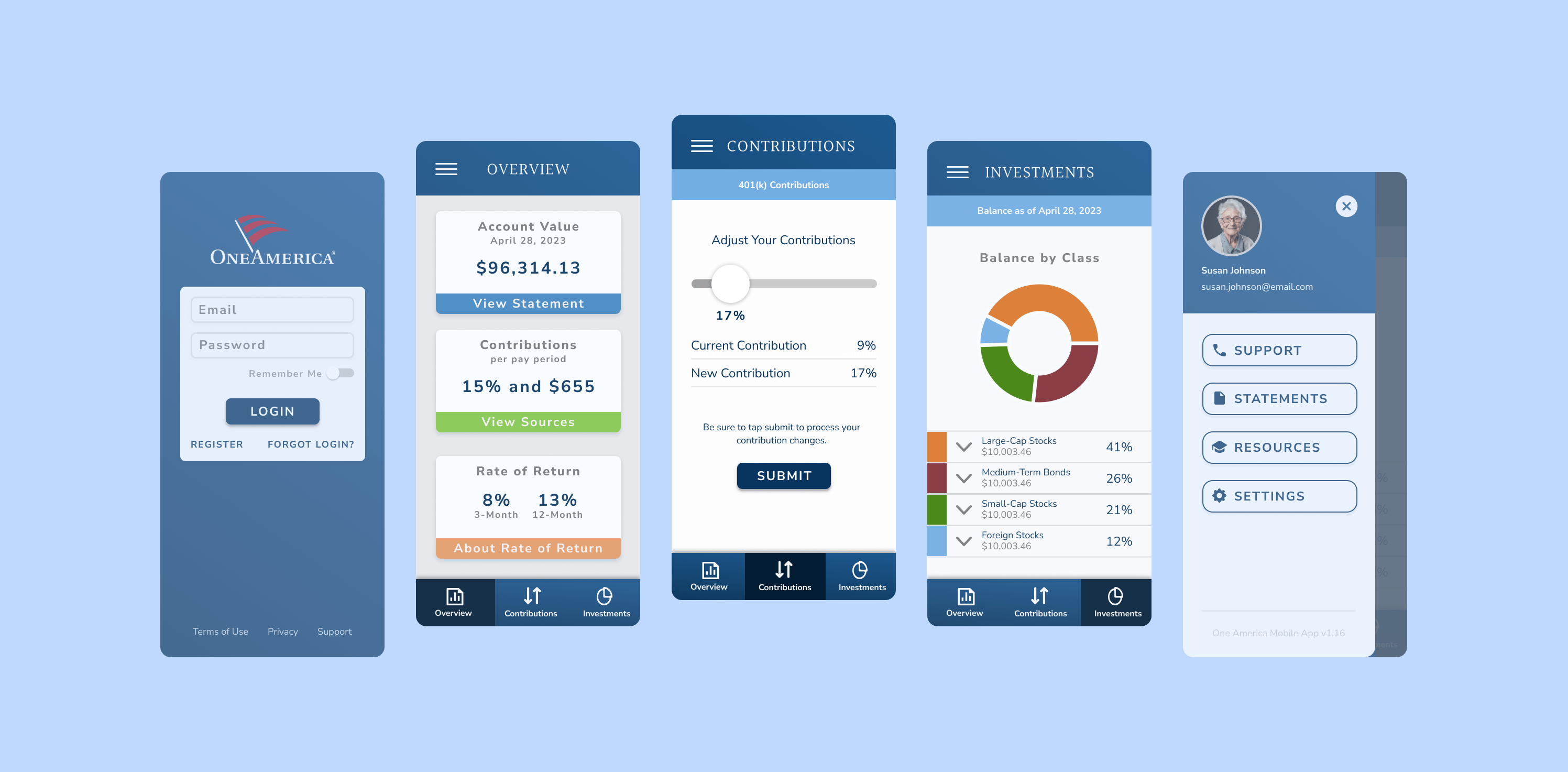
A robust accessibility-focused design system was created, including a defined color palette with WCAG-compliant contrast ratios (meeting AAA standards where possible), a flexible typography scale supporting larger base font sizes, and a component library featuring enlarged, clearly labeled interactive elements (e.g., buttons, form fields). This ensured consistency and compliance across the application.
User Interface
The final user interface features a clean, uncluttered aesthetic with ample white space. Prioritized information hierarchy ensures that key financial data is immediately visible and digestible. Customization options, such as adjustable font sizes and high-contrast modes, were integrated directly into the user settings, empowering users to tailor the experience to their individual needs.
Key Features Showcase


Reflection
This project reinforced the profound impact of empathetic and inclusive design. By deeply understanding the unique needs of older adults and rigorously applying accessibility principles, we not only created a highly usable product for our target demographic but also inadvertently improved the overall user experience for all age groups. It highlighted the critical importance of continuous user feedback in achieving truly impactful design outcomes.
Key Learnings & Future Vision
The success of this redesign demonstrated that accessibility is not a niche feature but a fundamental driver of broader usability and business value. Future considerations include integrating voice navigation capabilities and expanding personalized financial insights to further empower senior users.

"This app feels like it was designed just for me. Managing my finances is no longer a source of frustration."
— Eleanor P., One America Client